Rever
Rever built software for continuous improvement in manufacturing. The company had a Sequoia-backed vision and an outsourced MVP. I joined as the first designer, rebuilt the product foundations, and eventually led design across product, systems, and team growth.
Screenshots. No files. No system.
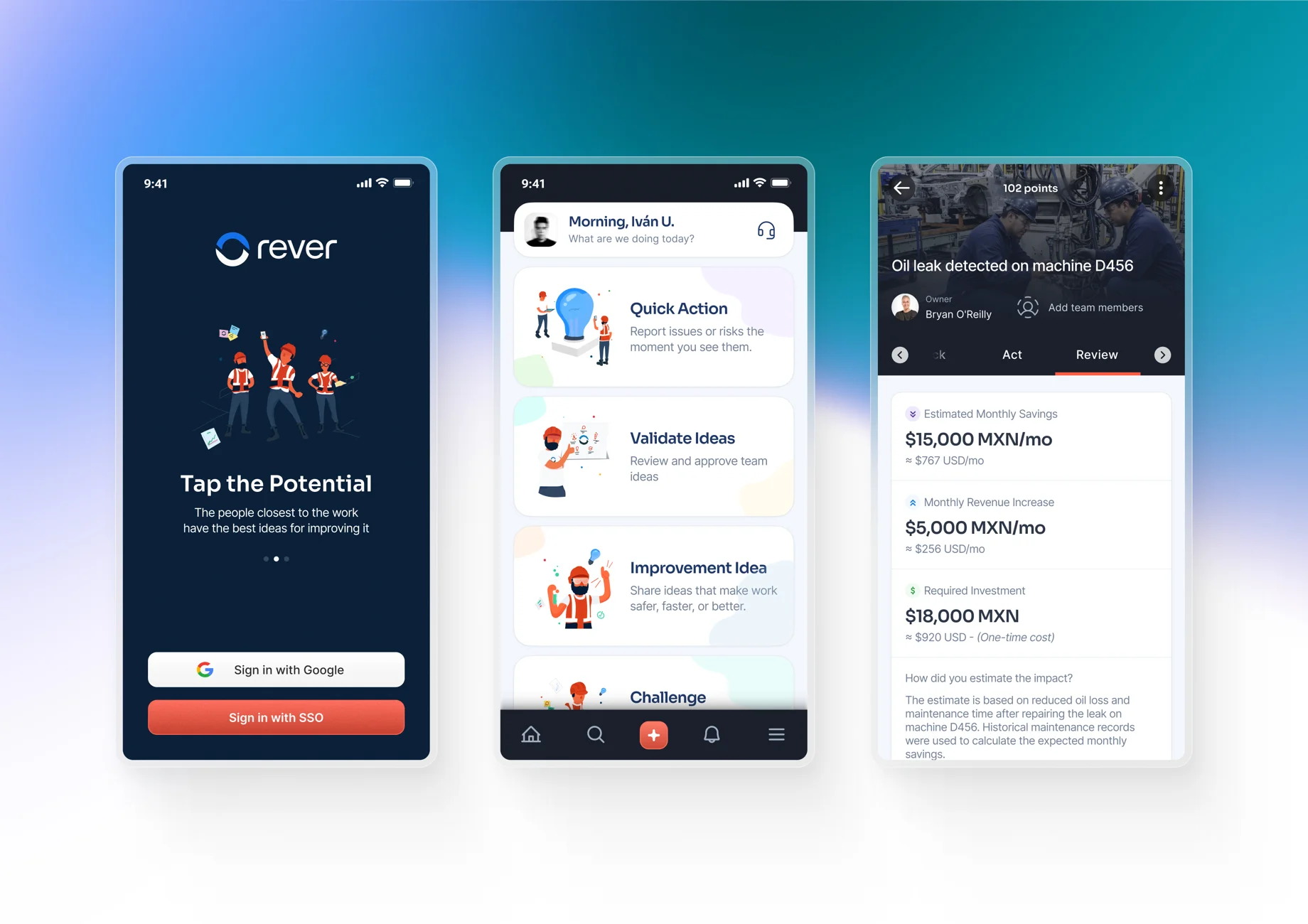
There were no editable files. No components, no styles, no handoff. Just a folder of screenshots and fragmented visual references. The product had been outsourced for the initial pilot: a simple mobile app where the main action was capturing an idea and routing it through 5S process logic.
It worked well enough to raise a seed round, but it wasn’t a product yet.
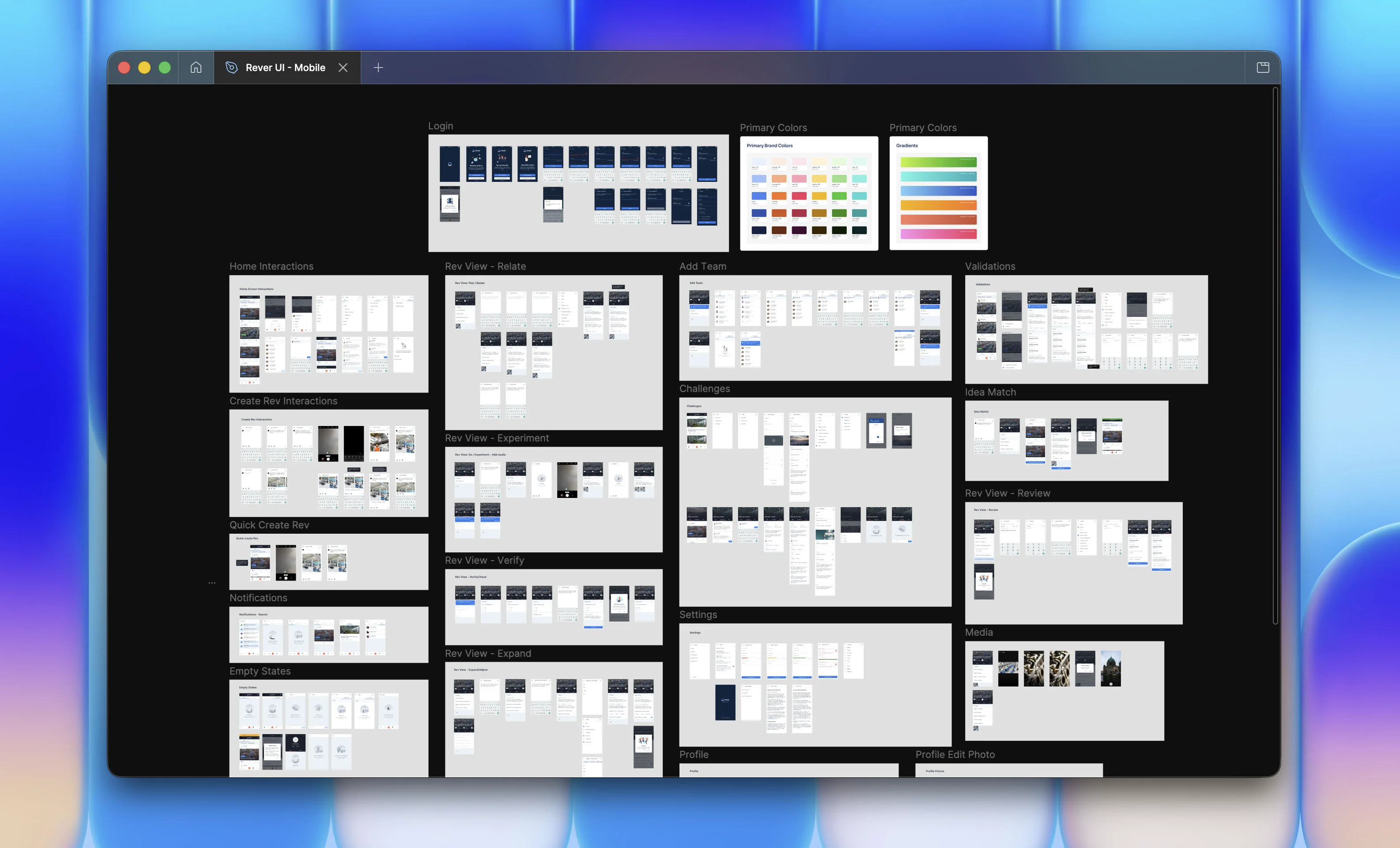
I rebuilt multiple screens from zero and took over the mobile redesign as the company moved past MVP mode. The formal title was UI/UX Designer. The actual job was turning an early pilot into a product.
Consumer UX assumptions break the moment you walk into a plant.
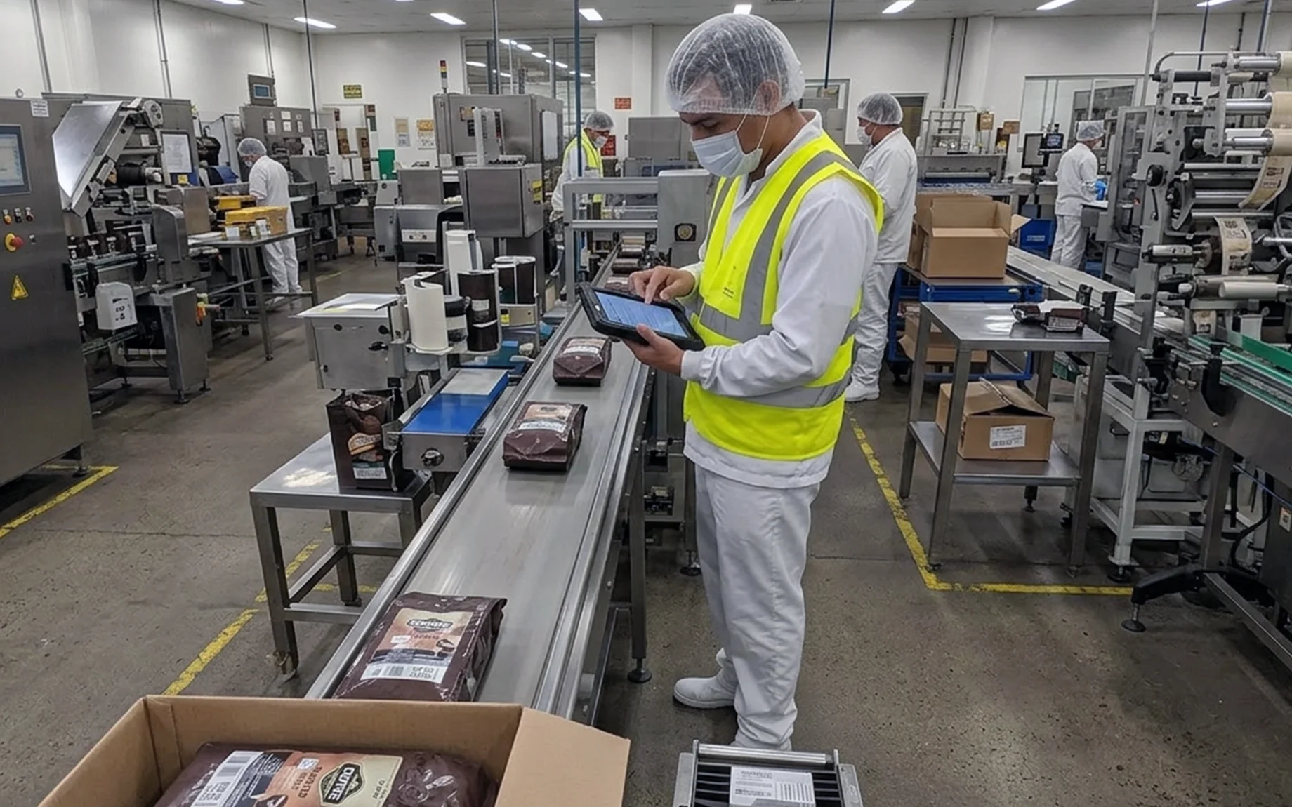
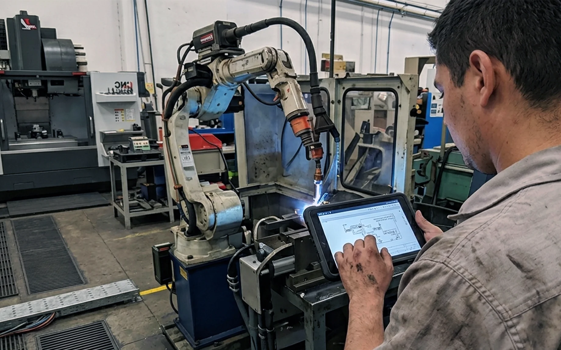
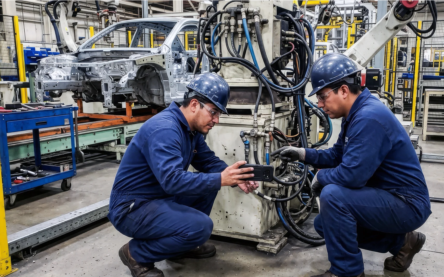
As Rever expanded into automotive, pharmaceutical, and food manufacturing, I started doing on-site plant visits. Not to present, just to watch.
The product had been designed by people who used software all day. It was being used by people who didn’t. That’s a different product. Screens were shared. Sessions were short. People were standing up, sometimes wearing gloves. Navigation patterns that any product designer would treat as obvious weren’t intuitive in that context.
I mapped what users were actually doing versus what the interface assumed, then rebuilt from there. Larger touch targets, high contrast, progressive disclosure that surfaced the common action right away. The goal wasn’t simplification. It was clarity under real conditions.
Some foundations are wrong. You just don’t know until the product tries to scale.
The first redesign cleared the immediate debt. The second one was harder. It meant admitting that several early foundations weren’t just unpolished but actually wrong for this user base, and needed to be rebuilt entirely. I pushed for that call. Patching what exists is always easier. But I’d spent enough time on plant floors to know that incremental fixes weren’t going to close the gap between how the product worked and how these users actually thought.
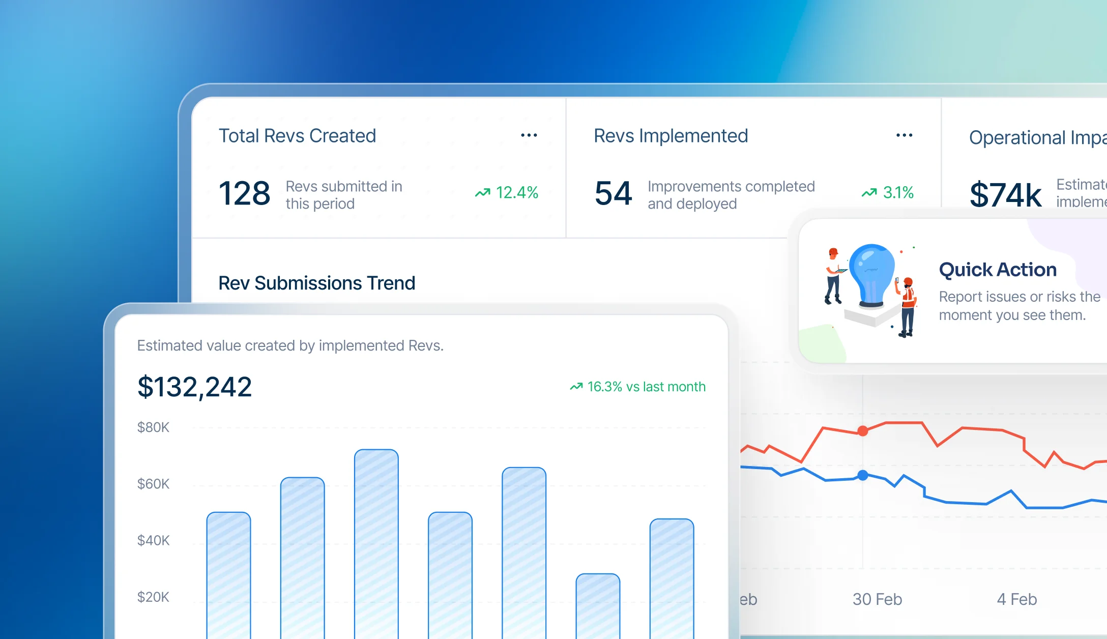
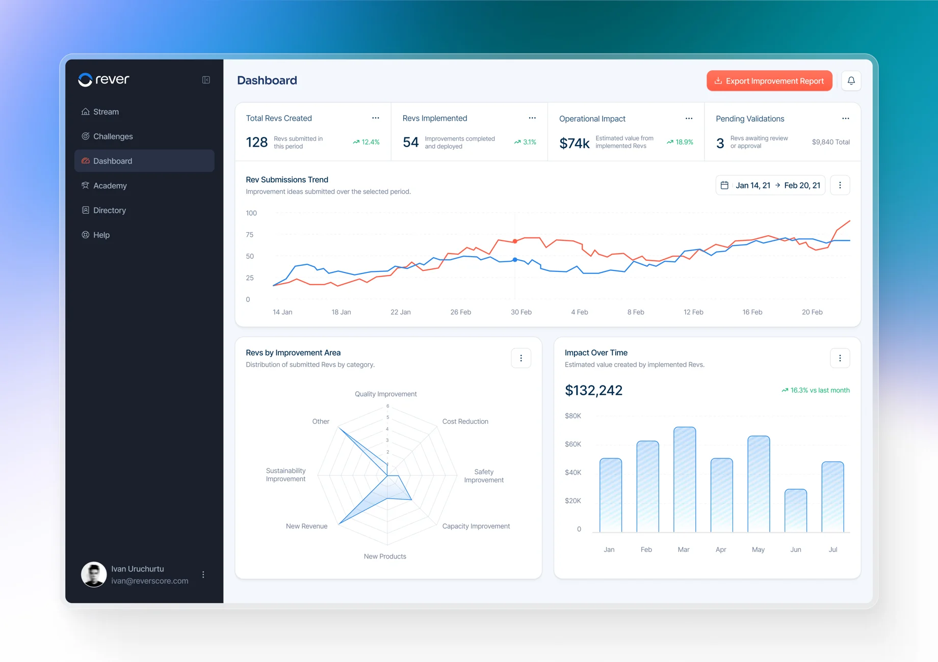
The mobile redesign ran in parallel with a new management dashboard. The product always had two users: the worker and the manager. For the first time it had two interfaces built around the same underlying process. Connecting those surfaces instead of treating them like separate products was the right architectural call. The tradeoff was more complexity: shared states, permissions, and transitions all had to be tighter. But it made the product more honest, and more useful. Managers had been exporting data to Excel constantly, which is a reliable signal that the product wasn’t answering their questions. After the dashboard redesign, Excel exports dropped 41 percent.
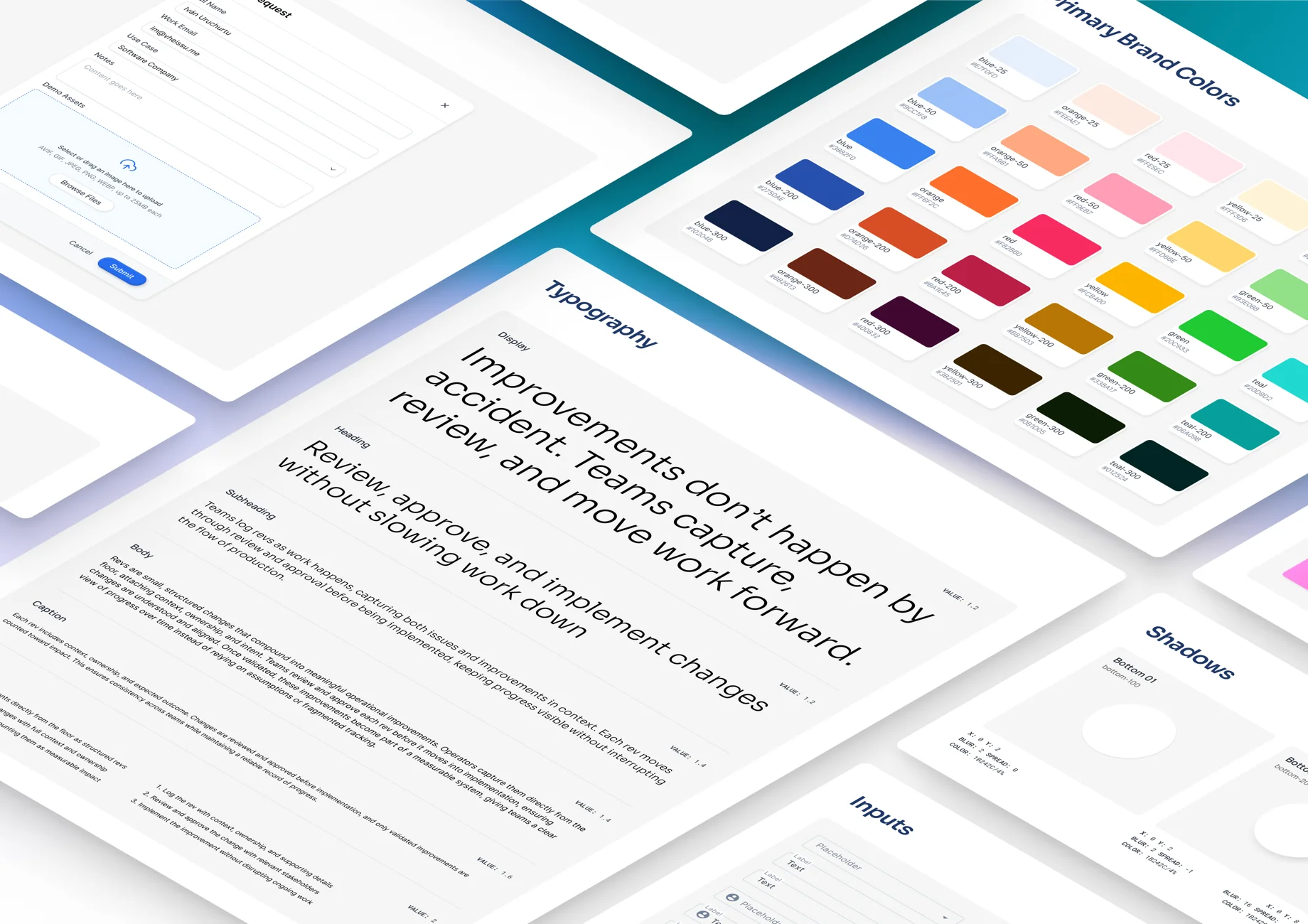
The design system came out of this phase. Not as a planned project, more out of necessity. The team was growing, features were multiplying, and without a shared foundation every screen ended up being a one-off. I built the system: tokens, components, patterns, documentation. It wasn’t beautiful to start. It was functional and durable.
A bigger round doesn’t just mean more resources. The stakes are different.
After Sequoia, scaling pressure expanded across every function at once. I was promoted to Head of Design. The team reached four designers at its peak.
Now I was hiring. Running critique. Writing process documentation. Partnering with engineering on estimation. I also started extending into customer experience beyond the interface itself: onboarding touchpoints, rollout logic, and how enterprise customers actually got value in the first weeks.
The product expanded fast. The core model grew from one idea type to three, each with its own submission logic and design language. One move I’m proud of was linking routine findings so they auto-converted into quick actions. Before, a worker would log a finding during a routine, and then separately create an action to fix it. Two steps, two contexts, and most of the time the second one never happened. Connecting them meant the action was already there the moment the finding was logged. A small interaction decision with a direct line to the North Star metric. That kind of leverage only shows up once you’ve been in the product long enough to see how the pieces connect.
The most important thing I made at Rever wasn’t a screen.
Two of the designers I brought onto the team came from graphic design. Strong visual instincts, but no product process and no systems thinking. I trained both directly, through critique, through sitting together on hard problems, through teaching them to interrogate a user flow rather than just style it. Both are senior product designers now.
I left Rever in 2021. The team kept going. The design system kept scaling. Patterns I’d established kept shipping into a product used on factory floors I’d never visit, by workers in languages I don’t speak.
Five years is long enough to see your early decisions age. Some held up. Some I rebuilt. The ones I’m glad I got right were the system, the process, and the people I mentored. Those outlasted my tenure. That’s the only metric that ever really mattered.
Up next
Neurelo
Database to API platform. 2 years, full ownership.